THE CONCEPT
WARMTH & COMMUNITY
HANDMADE · TACTILE
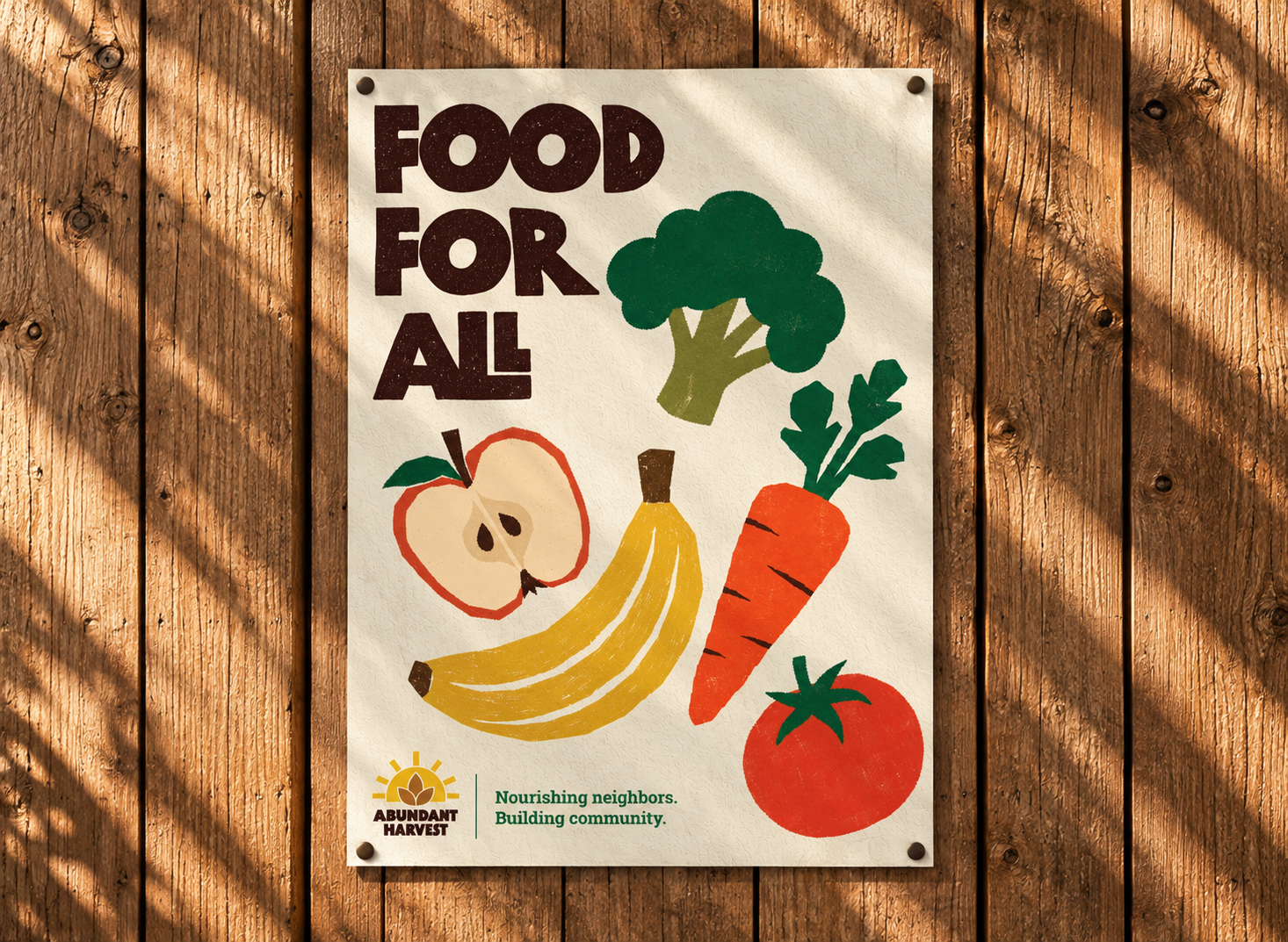
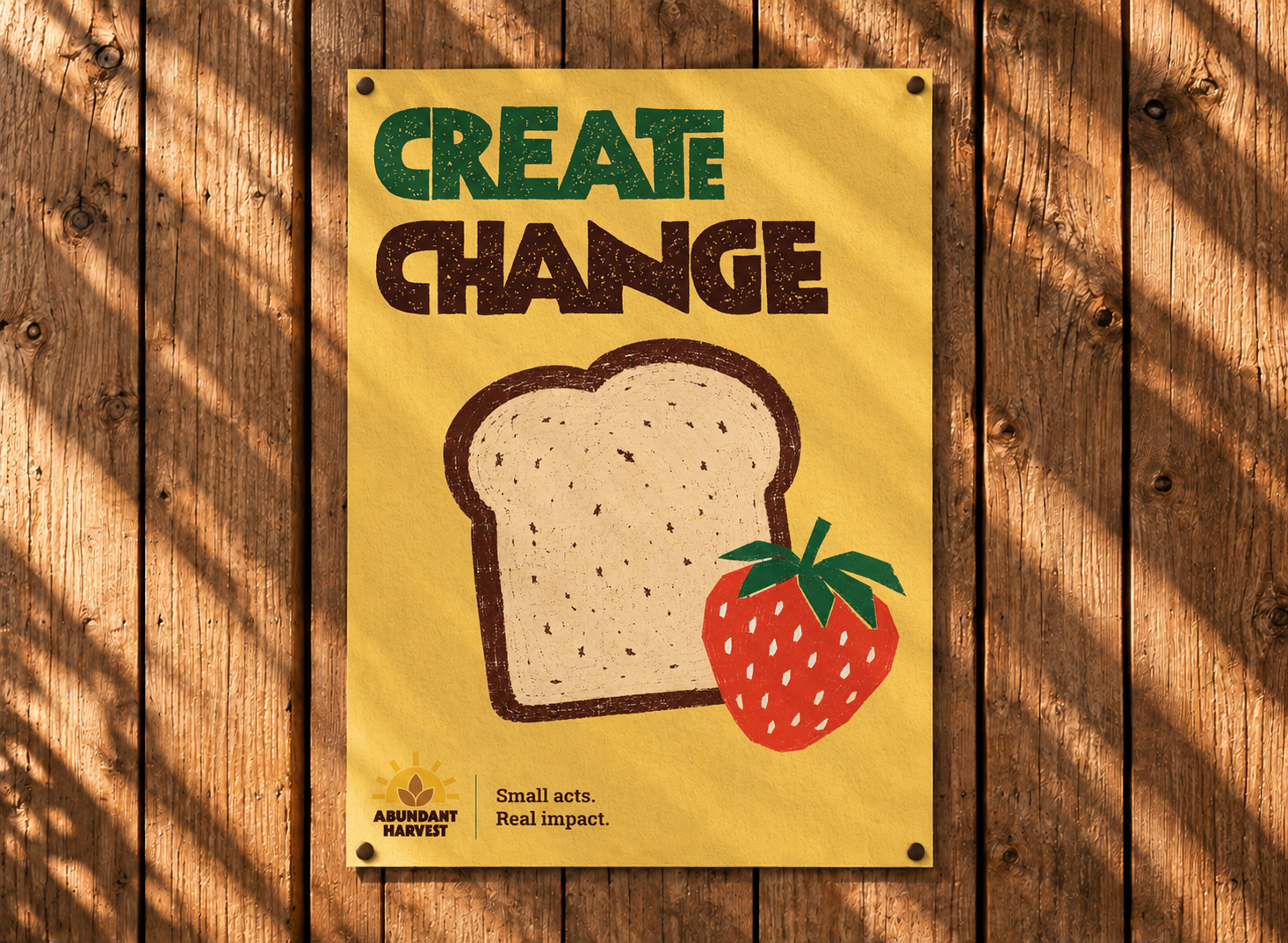
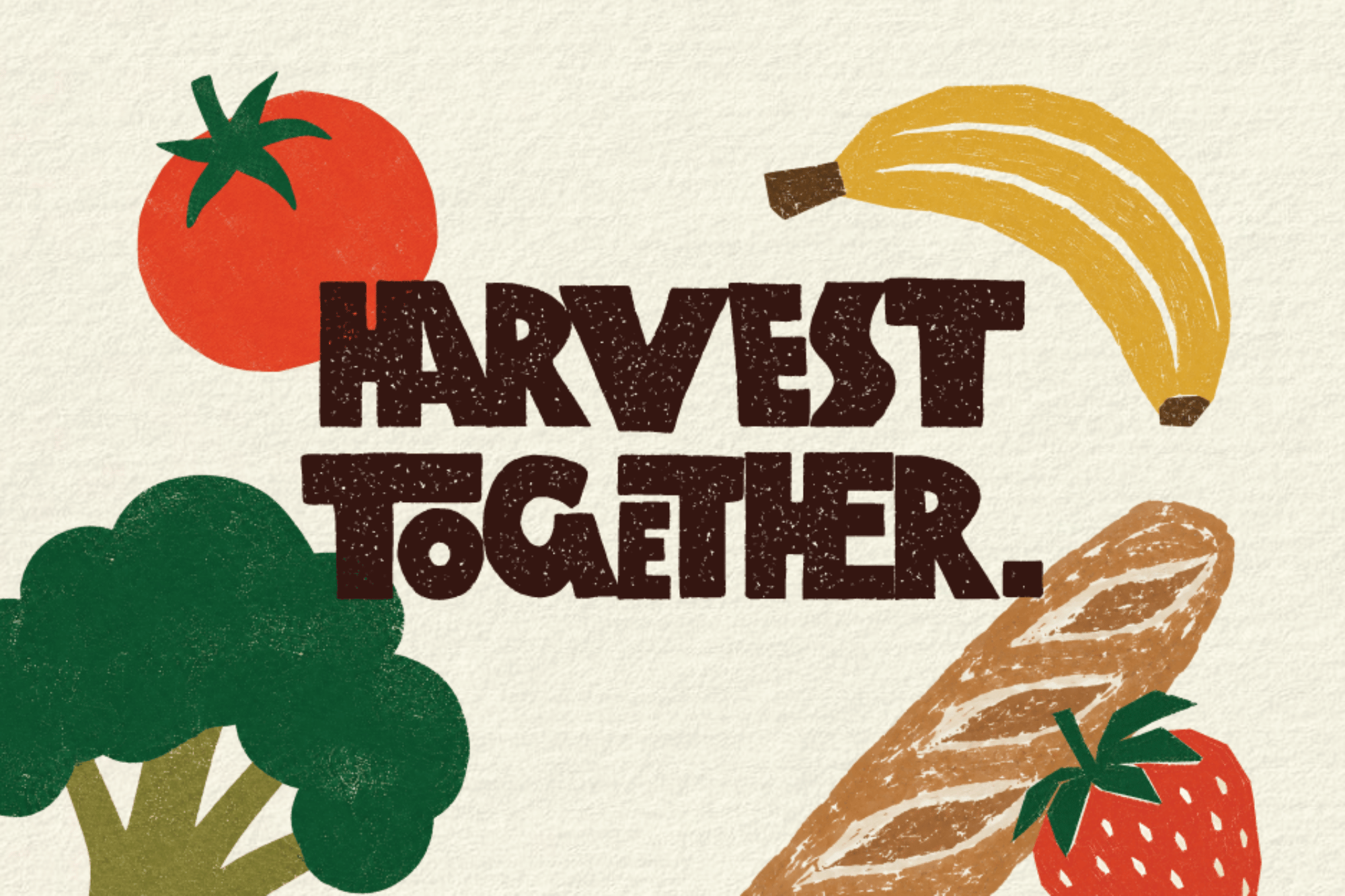
Rather than relying on sterile, institutional non-profit imagery, I leaned into a bold, handmade aesthetic — cutout food illustrations and stamp-like textures that feel tactile, approachable, and grounded.
Hands reaching toward food and toward each other became the central motif, symbolizing dignity, community, and mutual care. Bright, earthy colors and expressive type keep the tone celebratory across posters covering food access, volunteering, and donations.
Created as a conceptual awareness campaign for an active food pantry in The Woodlands, Texas, the identity can scale effortlessly across merchandise, social assets, and print materials.
Hands reaching toward food and toward each other became the central motif, symbolizing dignity, community, and mutual care. Bright, earthy colors and expressive type keep the tone celebratory across posters covering food access, volunteering, and donations.
Created as a conceptual awareness campaign for an active food pantry in The Woodlands, Texas, the identity can scale effortlessly across merchandise, social assets, and print materials.