THE CONCEPT
TYPE AS ARTWORK
IMAGE-TYPE INTEGRATION
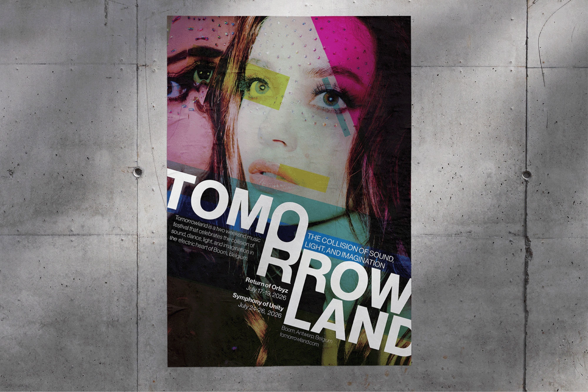
Instead of layering type over an image, I built the letterforms directly into the photograph — stacked, oversized, and tightly arranged to create rhythm and movement.
The high-contrast, minimal approach keeps the energy immersive without relying on extra graphic noise.
The high-contrast, minimal approach keeps the energy immersive without relying on extra graphic noise.